


0.1
Norin is a graphic design studio defining brands through clear structure, timeless aesthetics, and typographic discipline.
0.2
Selected Work
2014-2025

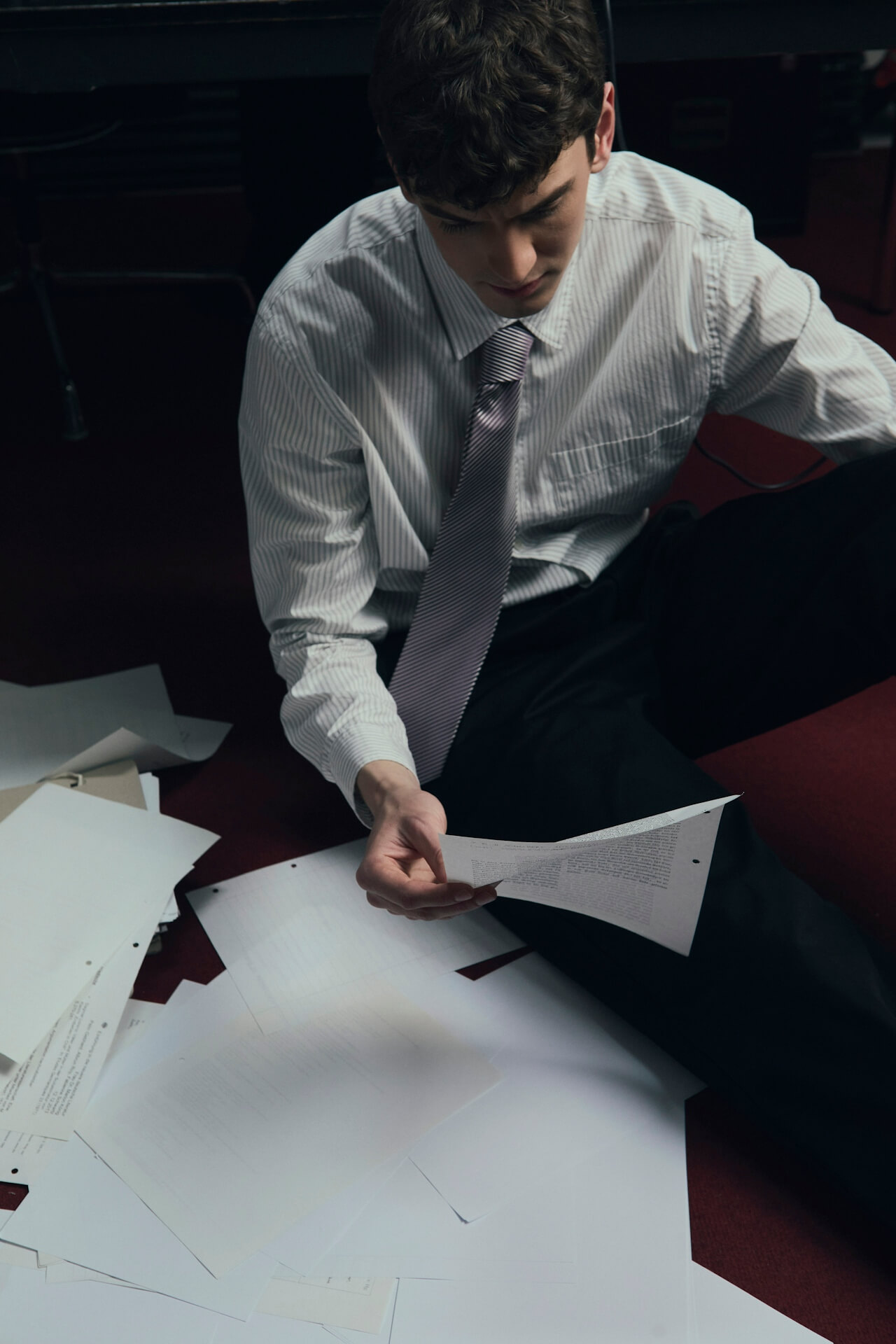


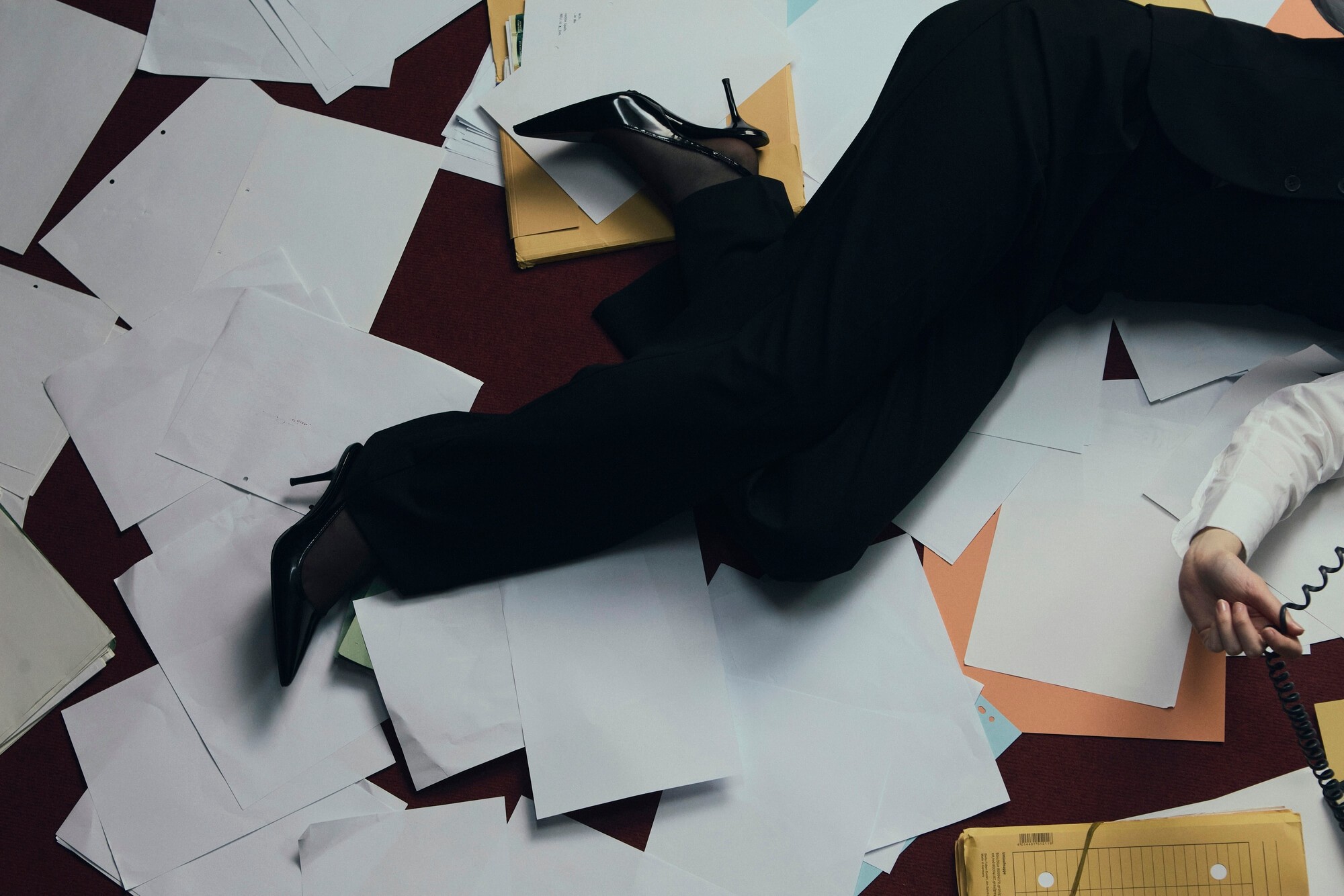

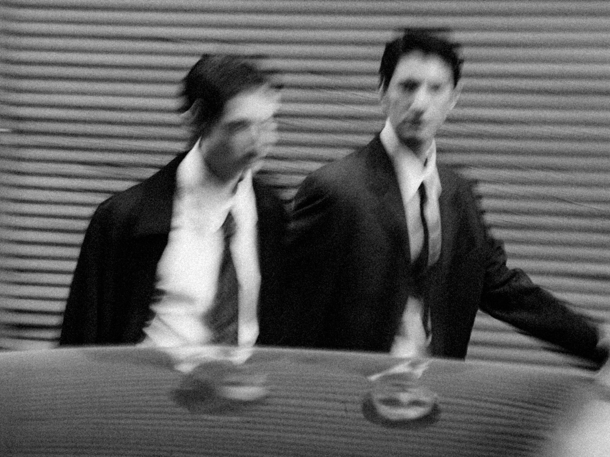
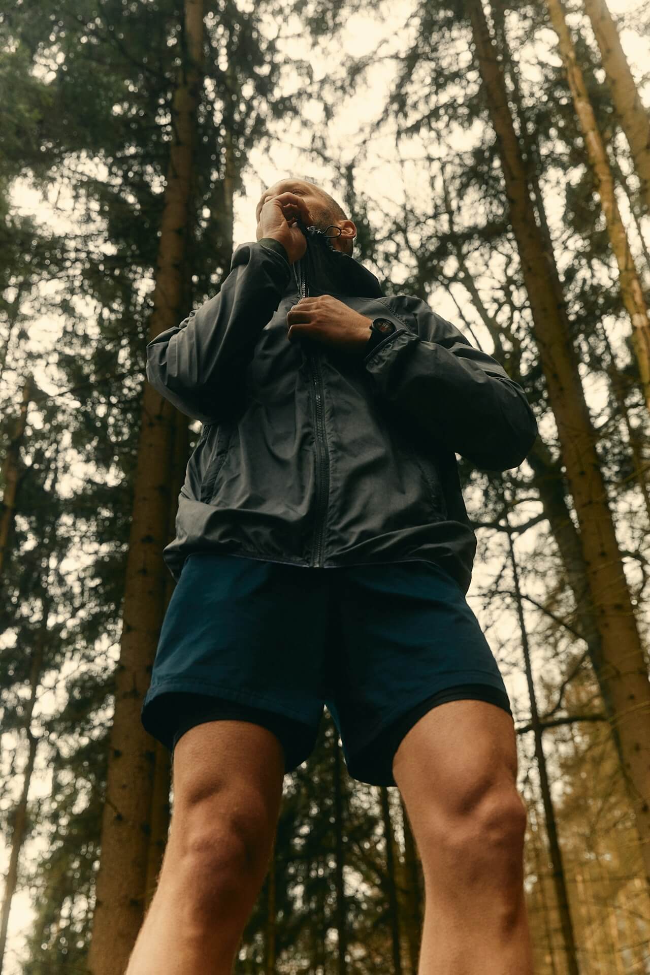
Digital Manifesto
A speculative design intervention for a fashion house rooted in deconstruction, exploring digital silence, spatial typography, and brutal hierarchy.
Sorelle
Digital Manifesto
A speculative design intervention for a fashion house rooted in deconstruction, exploring digital silence, spatial typography, and brutal hierarchy.
Sorelle
2026
Digital Manifesto
A speculative design intervention for a fashion house rooted in deconstruction, exploring digital silence, spatial typography, and brutal hierarchy.
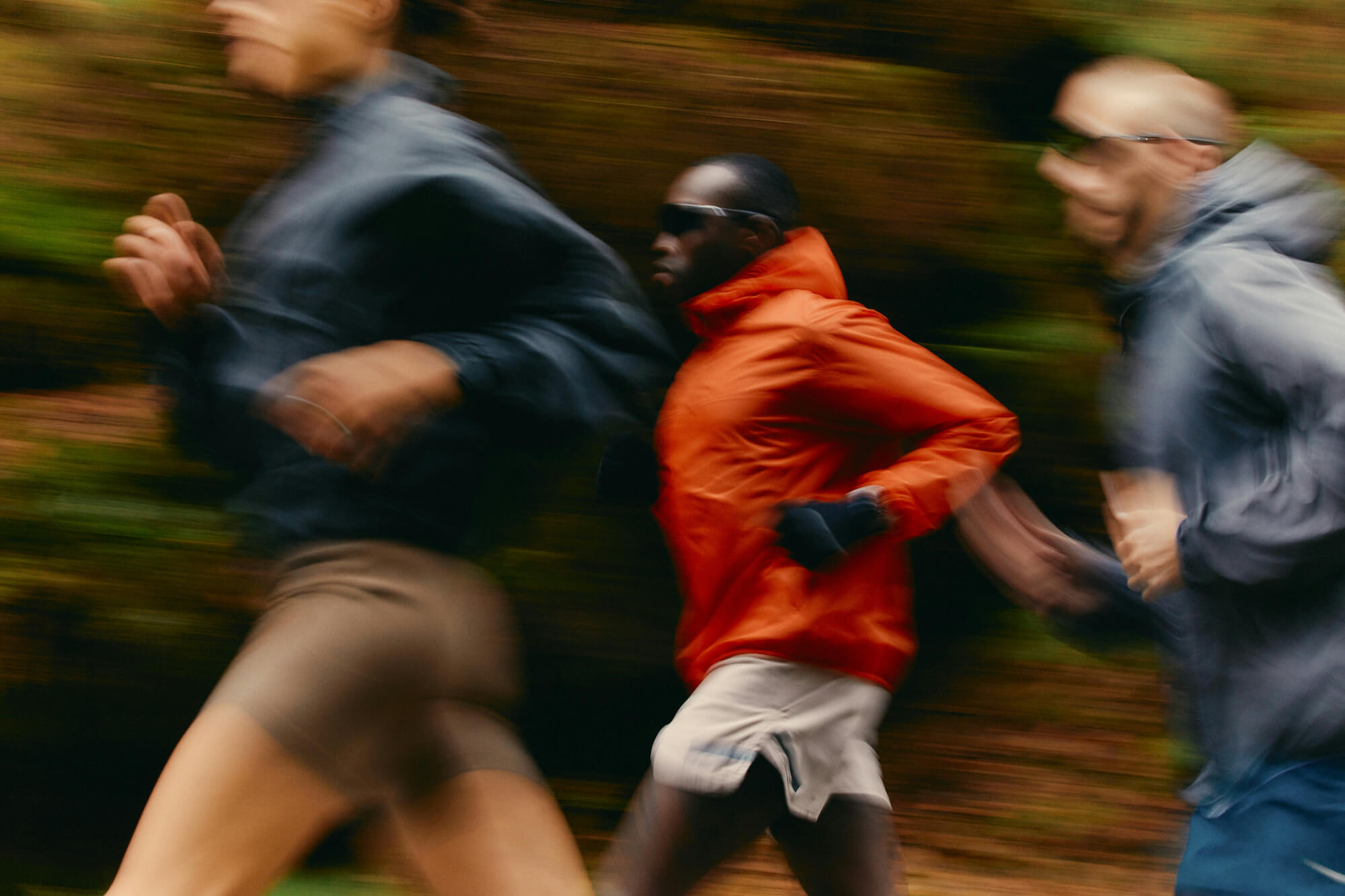


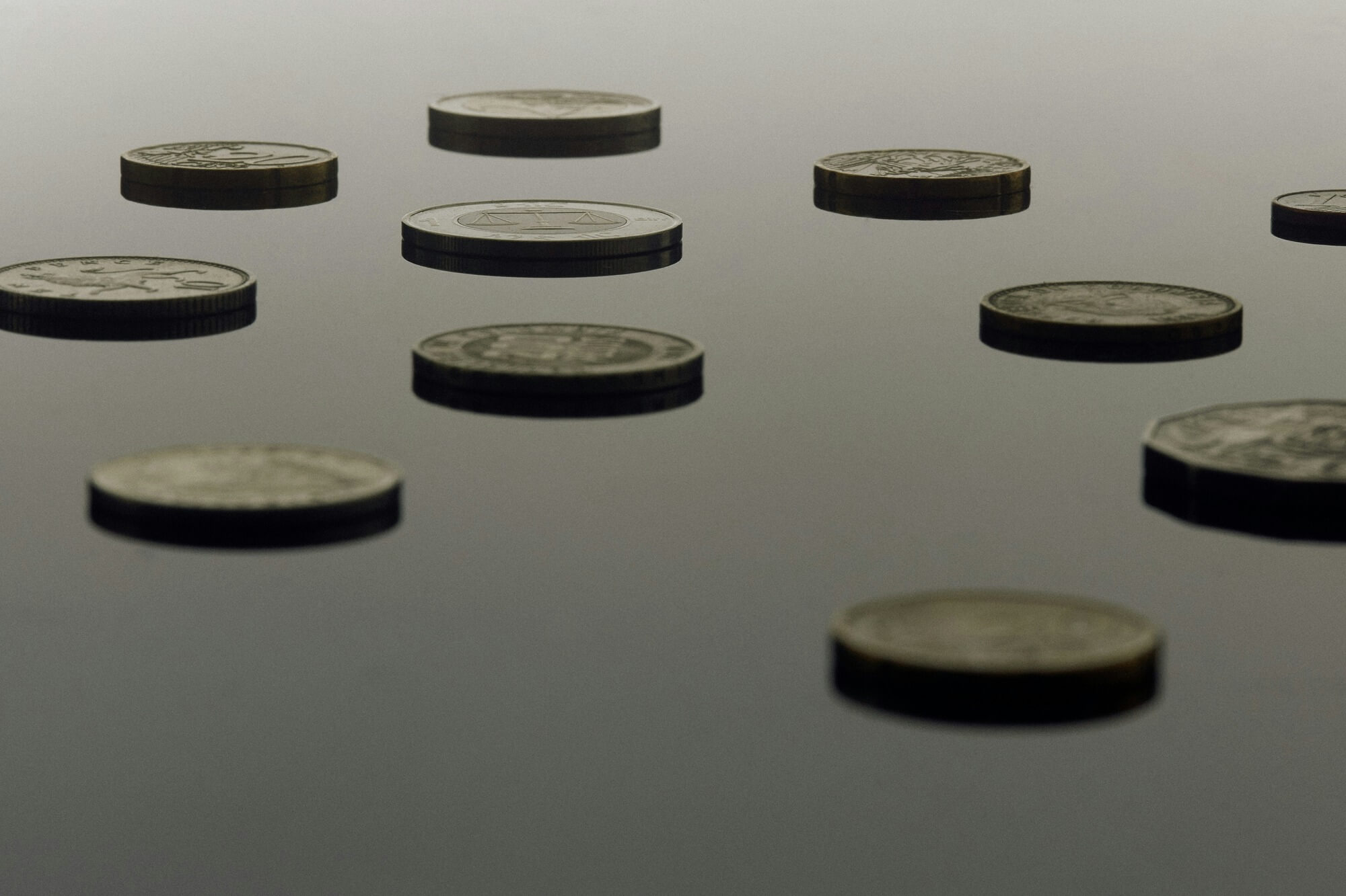
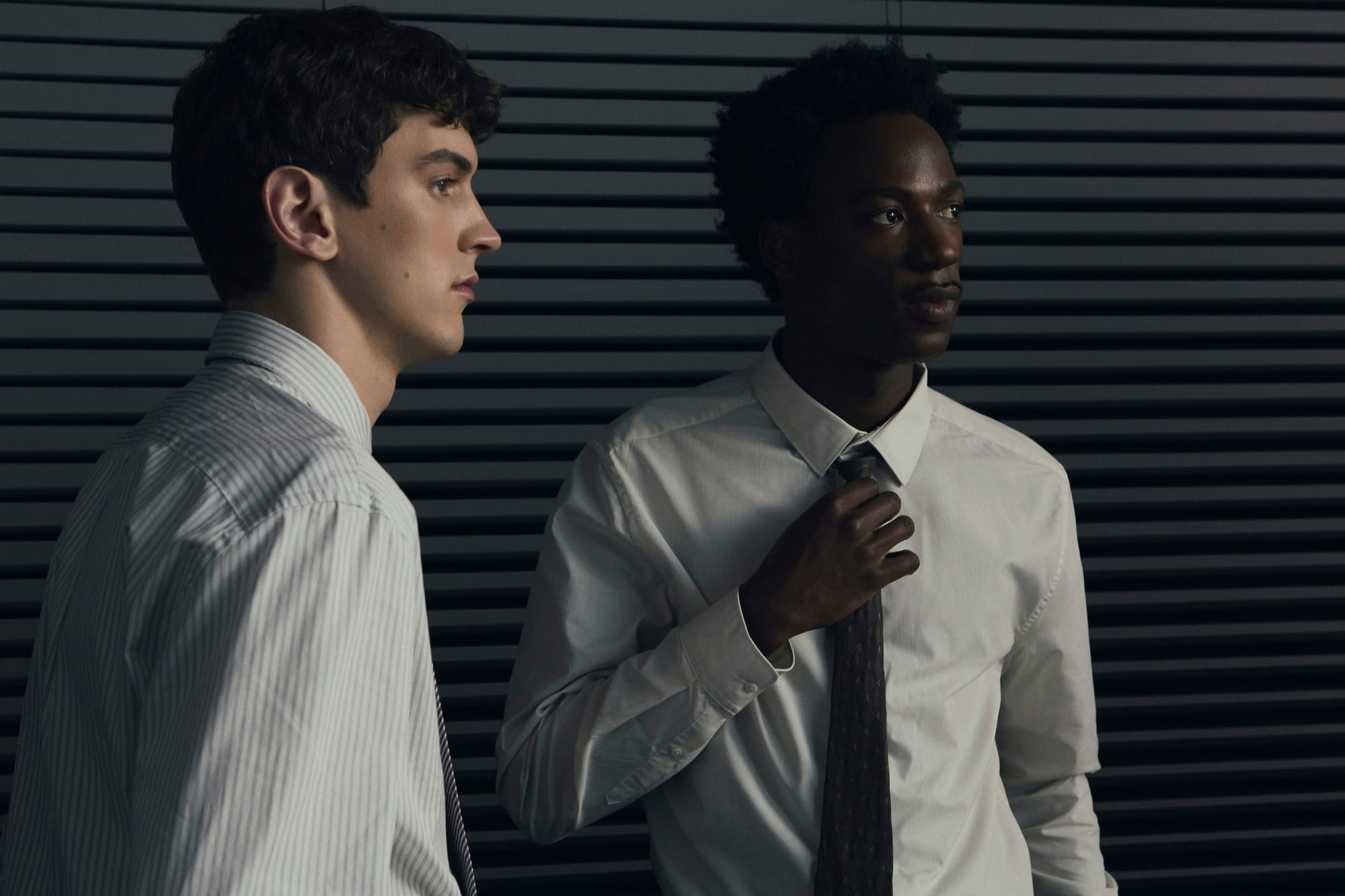
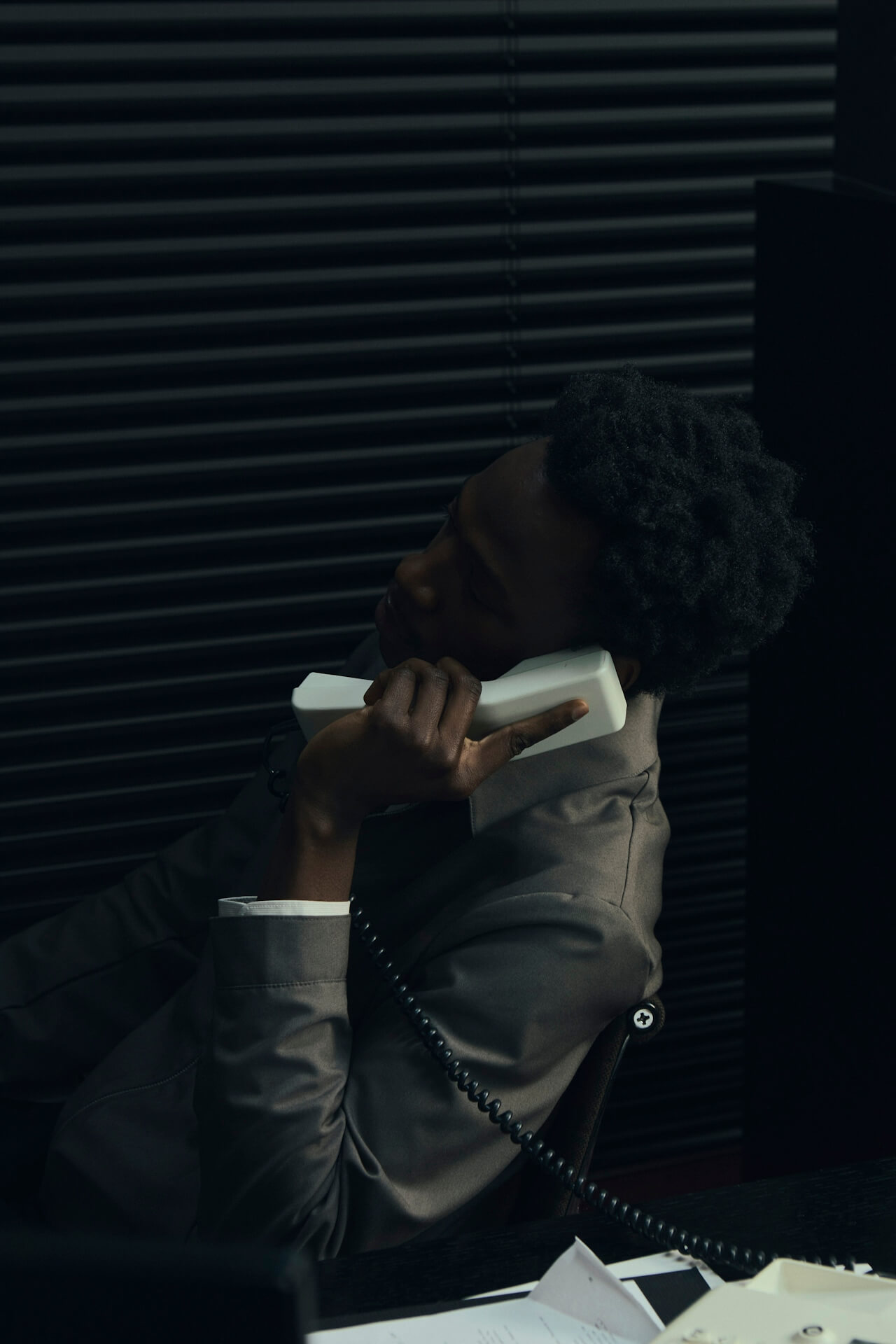
Campaign Motion System
A kinetic brand layer for a performance-driven label, designed to bridge static identity with dynamic expression across campaign and product moments.
Motion
Campaign Motion System
A kinetic brand layer for a performance-driven label, designed to bridge static identity with dynamic expression across campaign and product moments.
Motion
2025
Campaign Motion System
A kinetic brand layer for a performance-driven label, designed to bridge static identity with dynamic expression across campaign and product moments.

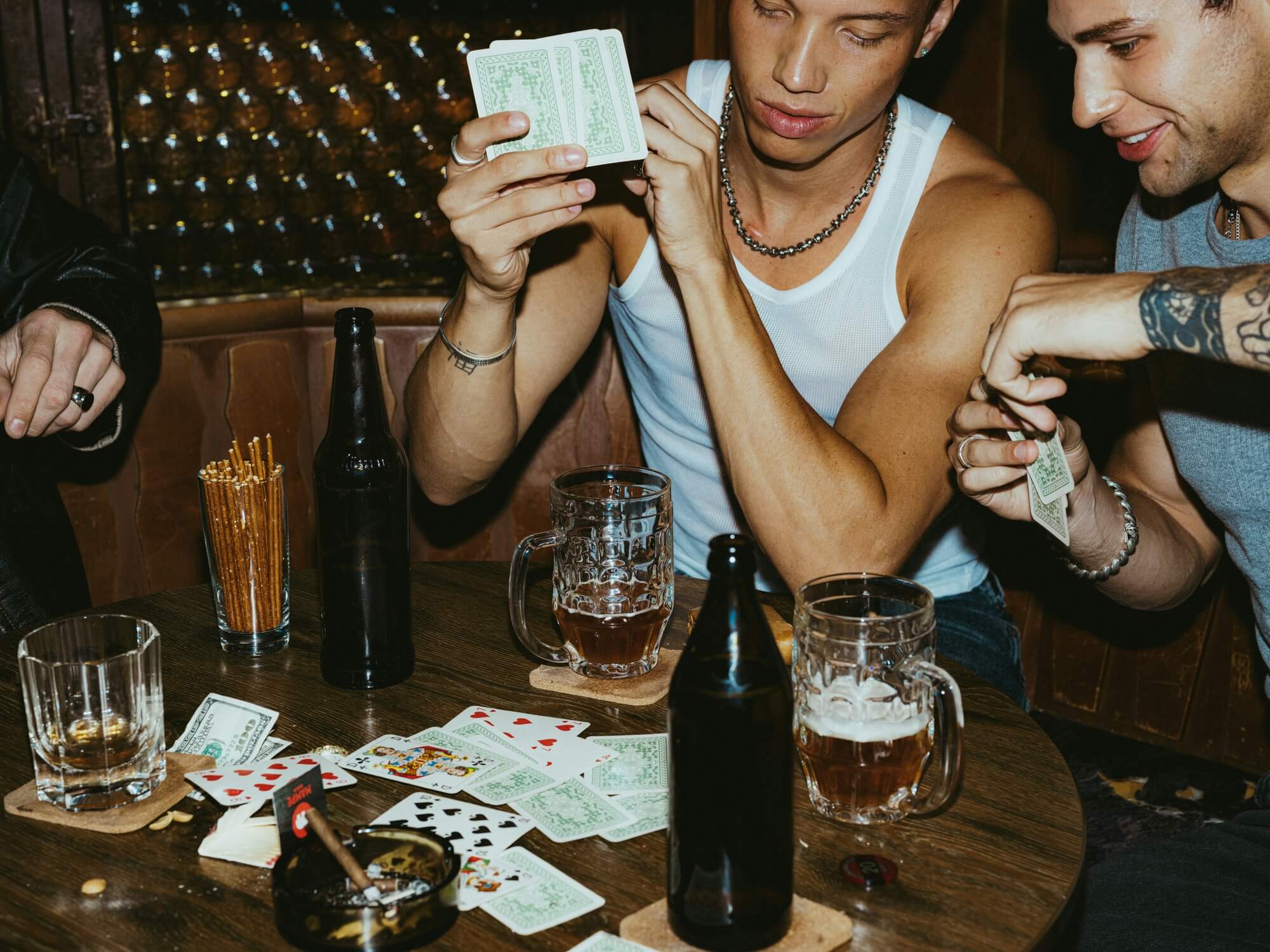


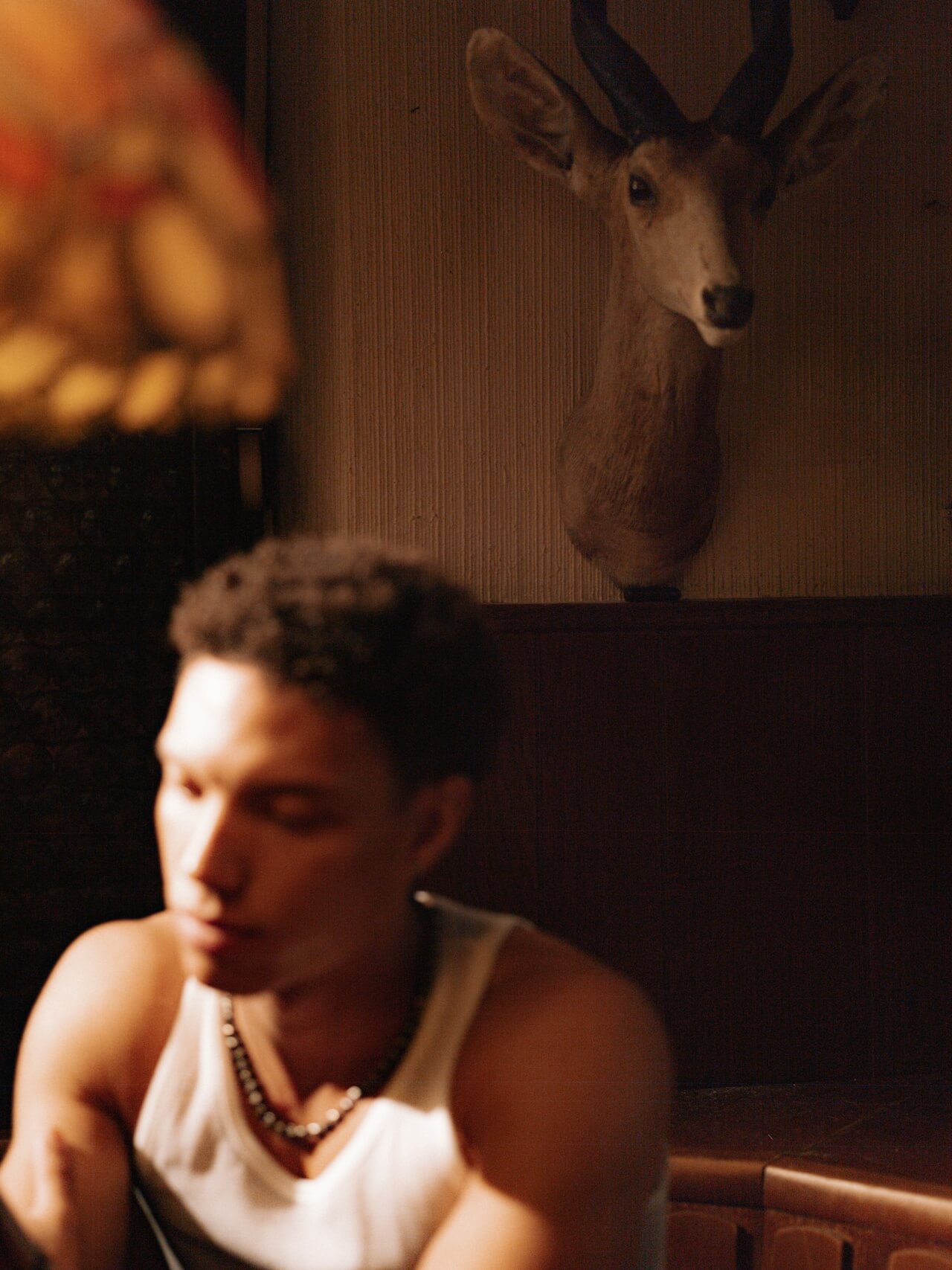
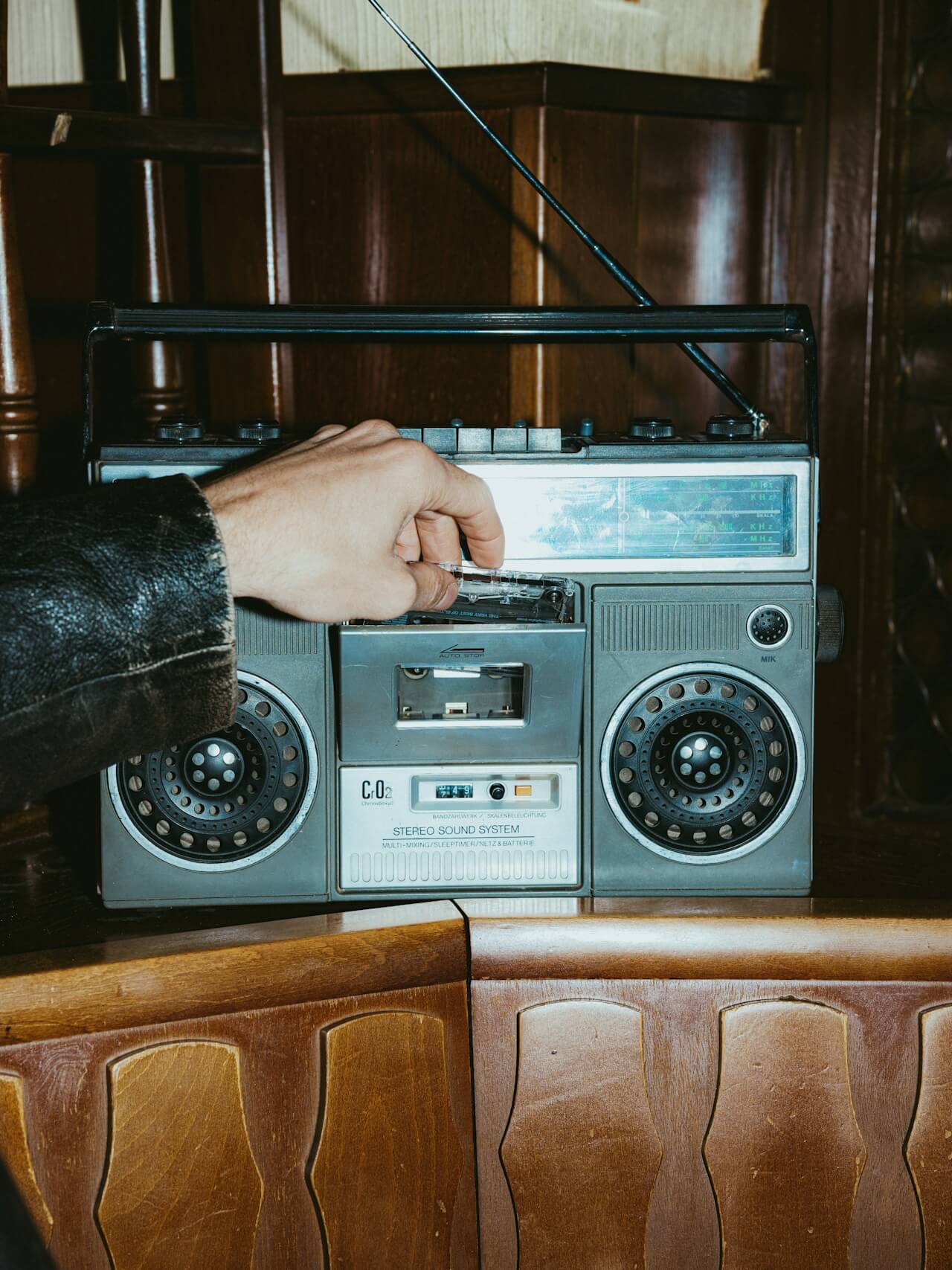
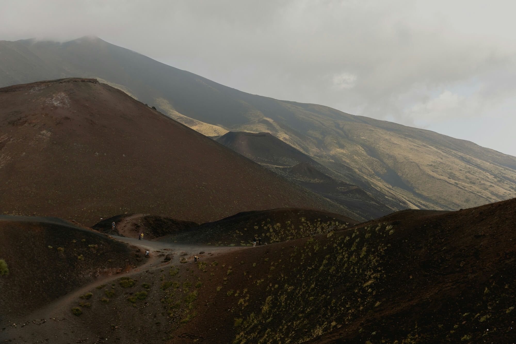
Spatial Identity
A brand and spatial system developed for a contemporary bar centered on warmth, togetherness, and shared moments.
Common Hours
Spatial Identity
A brand and spatial system developed for a contemporary bar centered on warmth, togetherness, and shared moments.
Common Hours
2025
Spatial Identity
A brand and spatial system developed for a contemporary bar centered on warmth, togetherness, and shared moments.

1/24/26
Exploring typographic rhythm
We’re currently investigating how pacing can be controlled through typographic intervals across breakpoints. The aim is to create a system that reads more like spatial music than a static layout. This is part of a broader attempt to align grid logic with narrative tempo.

12/2/25
A Pause Between Projects
We’ve wrapped up three brand identities in the past two months. Today we’re not starting anything new. We’re reviewing, deleting, and archiving. Looking for patterns in our own work. What felt too easy? What did we avoid? This kind of pause isn't wasteful — it’s where perspective lives.

11/19/25
Not Another Design Trend
We’ve been asked to “make it look like that brand.” But similarity is a weak goal. We try to dig into what works underneath the surface. Is it restraint? Rhythm? Risk? When clients name aesthetics, we ask them what emotion they’re really after. That’s where design starts.

10/24/25
Visual Systems That Don't Steal the Story
We’re building an identity for a climate-led initiative where the content is already deeply human and urgent. The challenge is to design a system that supports without diluting. The grid is generous, the color restrained — it speaks by stepping back. It’s a reminder: clarity is often an act of respect.
1/24/26
Exploring typographic rhythm
We’re currently investigating how pacing can be controlled through typographic intervals across breakpoints. The aim is to create a system that reads more like spatial music than a static layout. This is part of a broader attempt to align grid logic with narrative tempo.
12/2/25
A Pause Between Projects
We’ve wrapped up three brand identities in the past two months. Today we’re not starting anything new. We’re reviewing, deleting, and archiving. Looking for patterns in our own work. What felt too easy? What did we avoid? This kind of pause isn't wasteful — it’s where perspective lives.
0.4
Trusted By
SR
SC
VC
EDO
MO
CC
ON
ST
NS
BO
0.4
Trusted By
Sorelle
Scandi
Vont Capital
Ekko Design Office
Motion
Criter Collective
Orr & Nidar
Stykke
Norme Studio
Brüel Office
0.4
Trusted By
Sorelle
Scandi
Vont Capital
Ekko Design Office
Motion
Criter Collective
Orr & Nidar
Stykke
Norme Studio
Brüel Office